Our WORKS
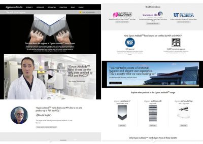
Dyson Airblade
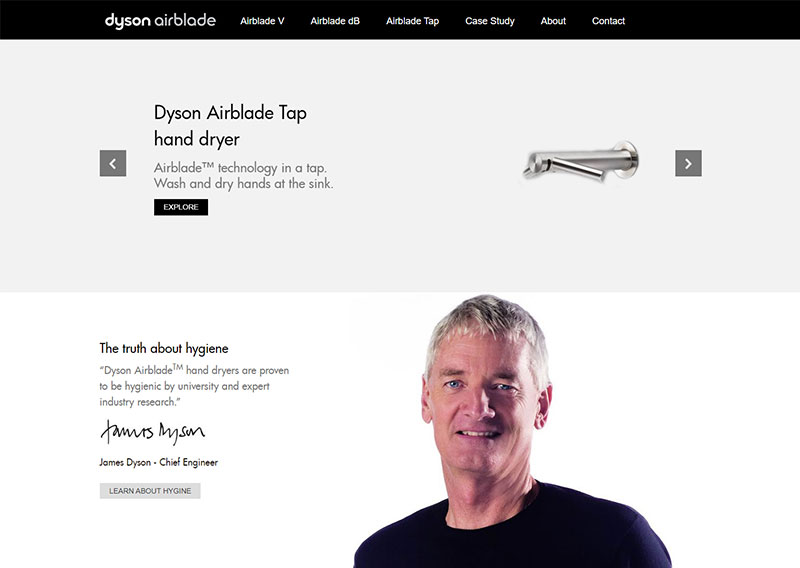
Exclusive Distributor of Dyson Airblade wanted to setup an informative and interactive site, focusing on the benefits and features, to aid the distribution of this B2B product,
Habitat Learning Centre
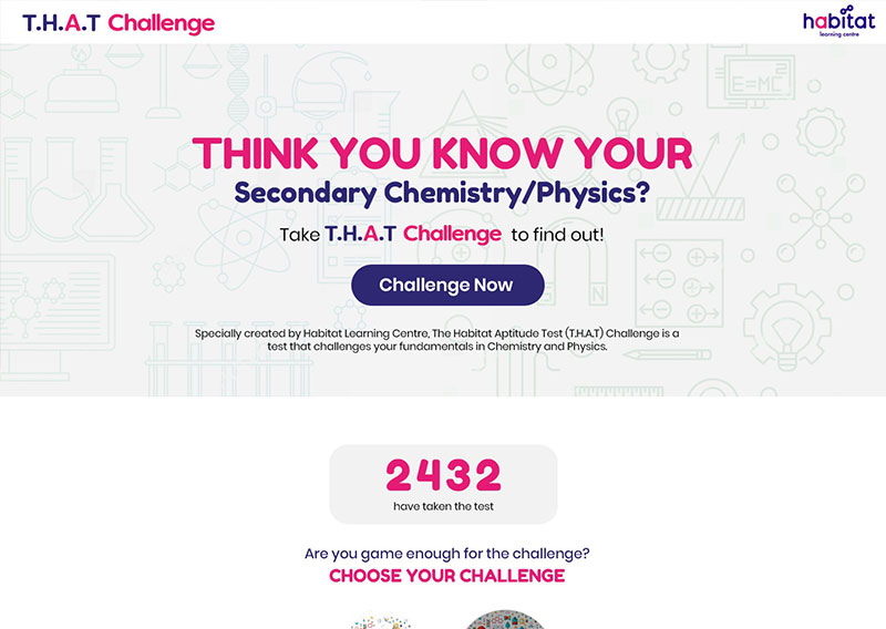
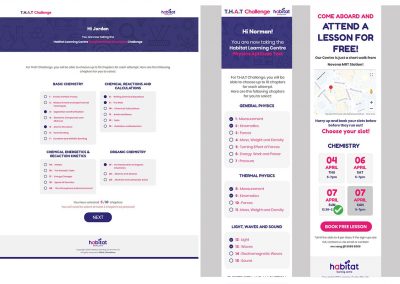
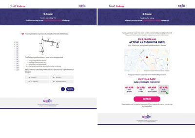
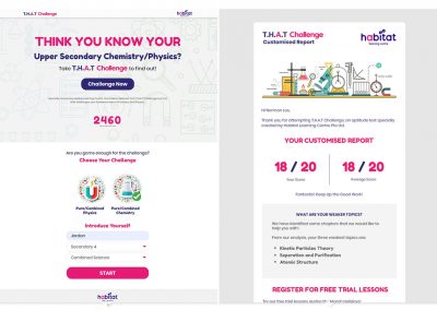
Habitat Learning Centre launched an aptitude test for secondary 3 & 4 students where they answer questions based on topics. Achieved over 2,000 tries 6 weeks after launch.
More Portfolio
Awesome Brands we have worked with


"Love the efforts in making our website responsive because our clients are likely to be on mobile. Crunch's gave valuable input to what contents stay and what should not also help to create a friendly mobile site."
– Joseph Tan, Dude’s Bakery
Looking for a reliable and quality design studio?
We Promise it will be worth your time
We would love to help you create or revamp a powerful website. Chat with us for a free consultation.
WEB DESIGN & DEVELOPMENT
Dyson Airblade
A benefits and features rich product marketing website

WHAT WE DID
Understanding the positioning of the product is important. This project for exclusive distributor of Dyson Airblade is to set up an informative website to showcase the benefits of these premuim hand-dyer. This website deploy a good number of animated images, interactive elements and comparison visuals to help potential buyers to make a more informed decision.
Benefits and features has also been effectively brought up; positioning the brand as a premium product and why it also surpass many other products in the market in term of cost saving.

Click to Enlarge
WEB DESIGN & DEVELOPMENT
Habitat Learning Centre
Top Tuition Centre in Novena

WHAT WE DID
Habitat Learning Center wanted to launch an aptitude test (sales funnel) for secondary 3 & 4 students for leads generation, as well as to establish her new branding in the education industry. Since it is targeting students of age 15 and 16, the colour theme chosen are dark blue and pink which happens to be the corporate colours.
The quiz leads to a report with animals identified representing each band of result. Customising the UI/UX to the target audience for better conversion with special attention catered to mobile usability.

Click to Enlarge
WEB DESIGN & DEVELOPMENT
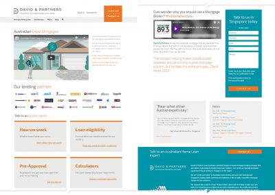
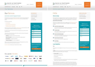
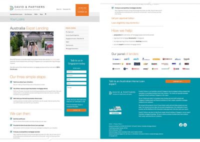
DAVID & PARTNERS
Australia Home Loan for Aussie Expat based in Singapore

WHAT WE DID
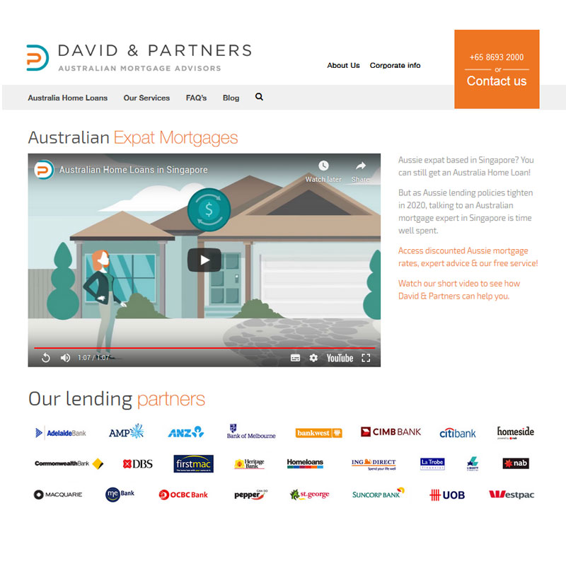
We worked hand in hand with David & Partners as they were embarking on SEM and SEO and would like to have a high converting website for leads collection. On top of that, they would like to have a fresh look for its website.
The concept was a unique, practical and effective website structure that are user-oriented and focuses on handling objections right from the start.

Click to Enlarge
WEB DESIGN & DEVELOPMENT
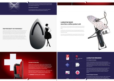
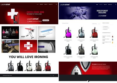
LAURASTAR
A Swiss company Dedicated to Ironing Technology

WHAT WE DID
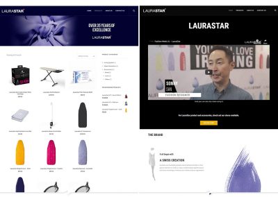
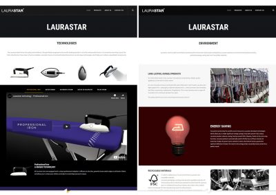
A bold red and black scheme was chosen because of the focus on technological breakthrough in Laurastar’s product. This also coincides with the Swiss flag which is a combindation of red and white.
Overall design outcome is a bold yet a clean feel of the site. Images are not rounded to maintain the sharp and sleek look.

Click to Enlarge
WEB DESIGN & DEVELOPMENT
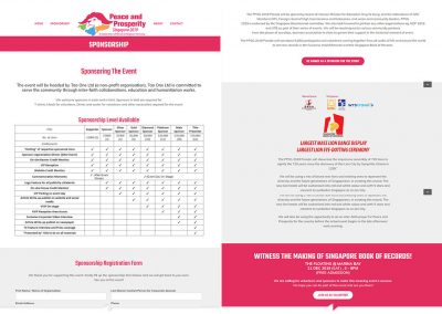
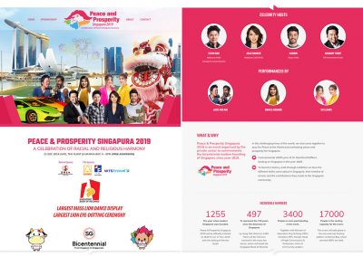
PEACE & PROSPERITY SINGAPURA 2019
A Celebration of Peace & Harmony

WHAT WE DID
This event celebrates the multi-racial and multi-religious harmony in Singapore.The lion head figure was used as it represents Singapore as a lion city. The lion’s mane is made up of 4 colours representing the 4 races of Singapore. The lion head has 2 hands clutched together representing peace.
Bright colour was also chosen as the event was meant to be a party of celebration.

Click to Enlarge
WEB DESIGN & DEVELOPMENT
MARIO SINGH
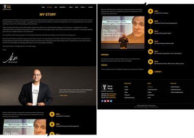
Renowned Forex Trader in Asia

WHAT WE DID
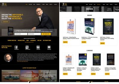
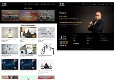
A warm brown colour scheme was chosen which associates with trustworthiness. Darker brown or black gives a feeling of mystic yet unknown or uncertainty. This is like the Forex market which is volatile and uncertain.
Therefore the mixed used of brown and black provides that trust despite of that uncertain and mystic feel of the Forex industry. Navigation was made simple and straightforward.

Click to Enlarge
WEB DESIGN & DEVELOPMENT
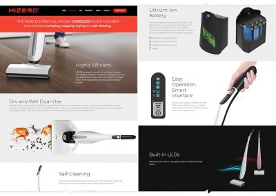
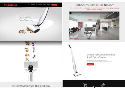
HIZERO
Simple yet Comprehensive 4 in 1 Floor Cleaner.

WHAT WE DID
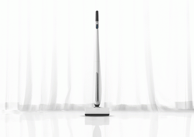
A unique dual floor cleaner for both dry and wet cleaning. White, clean looks are more suited as it is the desired results of superb cleaning. Parallax effect comes in handy showing mess is being cleaned up as user scrolls down on the home page.
Included is a warranty form to capture user’s input on newly purchased products.

Click to Enlarge
WEB DESIGN & DEVELOPMENT
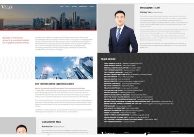
VERVE EXECUTIVE SEARCH
Specialised Headhunting Company

WHAT WE DID
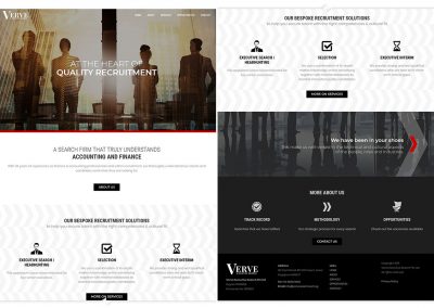
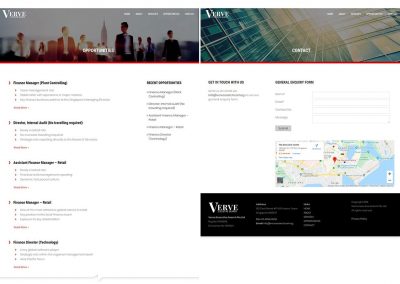
A simple and clean website of a recruiting firm that specialises in finance and accounting recruitments. A professional look with images carefully chosen that represents professionalism in work and service complete the website.
A steady font is used to provide a sense of steadiness with no corner-cuttings.

Click to Enlarge
